A Client Business Engagement
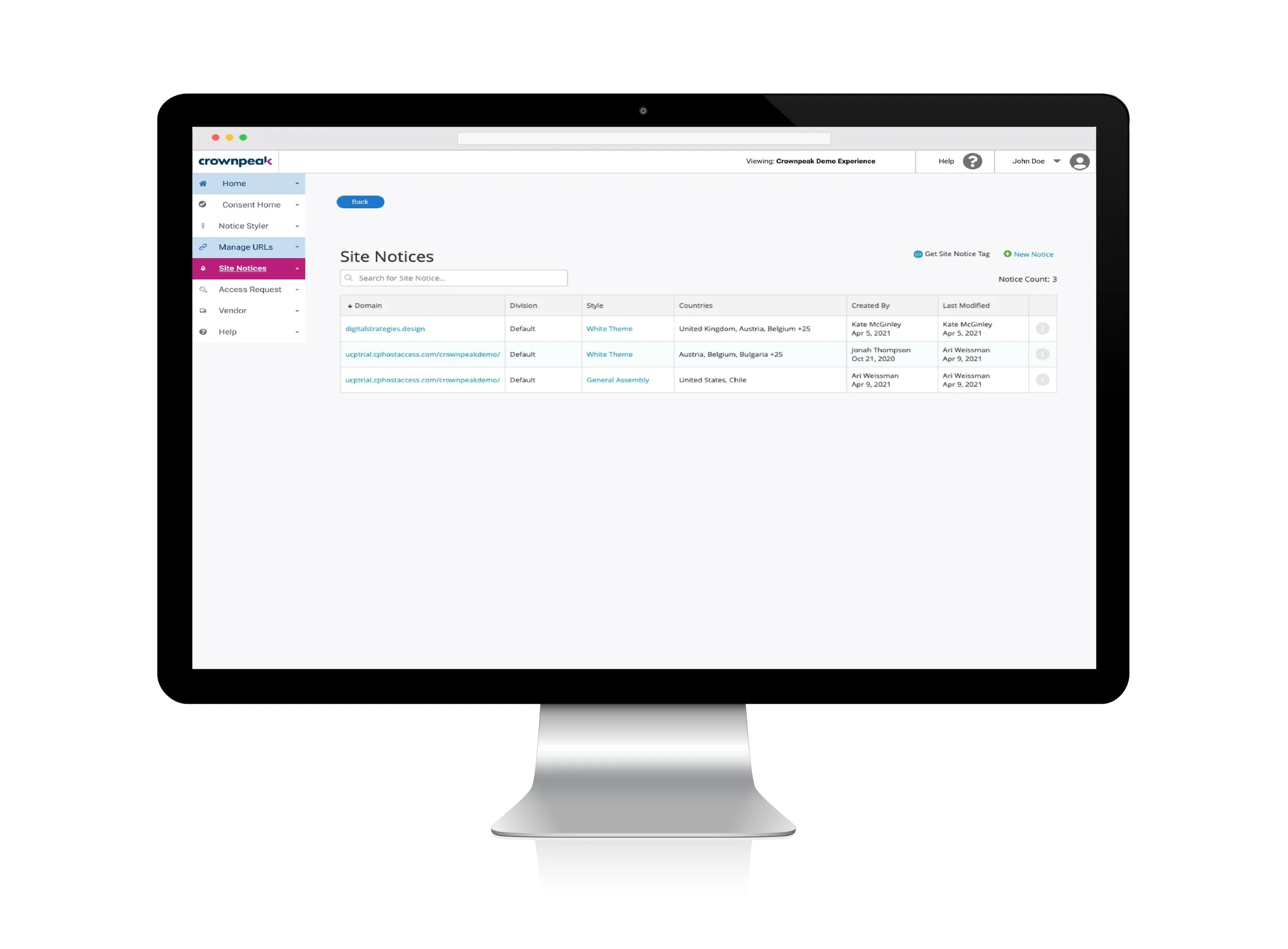
The Problem: Our client, Crownpeak, a Content Management Platform, needed a more customizable template for their privacy tool
The Solution: After weeks of thorough research, learning privacy sector jargon, and prototyping we developed a complete redesign of their privacy page with side navigation, hover boxes instead of a forced walkthrough, and clear labeling.
Role and Timeframe
UI Designer in a team of three other designers
Three-week sprint
Process
Research & Synthesis: Surveys, interviews, affinity mapping & user personas
Ideation & Delivery: Building a solution, rapid prototyping, usability testing
Tools
Trello
Figma
Miro
Google Spreadsheets
User Surveys
In order to figure out how people feel about content creation and website building, we conducted a survey asking 8 questions and received 22 responses. Some of the questions we asked were things such as
What are the most common annoyances you find when creating content?
After knowing what digital content you want to create, what are the barriers that may slow you down?
Have you ever had a difficult experience while creating content on a web-based platform? If yes, describe your experience.
Some of the primary survey takeaways:
Users need to have an up-to-date and intuitive way to quickly edit and interact with digital products they’re making
A common frustration was confusing navigation and needing to balance between getting lost with all the options and also getting enough options to fulfill their vision
User Interviews
We spoke with various users and these were some of our primary takeaways
There are so many options and no tutorial which can be especially difficult for people who don’t have a tech background
Our users found it difficult because there are so many options and tools they would need an in-depth tutorial and they feel overwhelmed thinking about it all at once
Another frustration from our interviews were that they feel like it takes forever and we have to change our vision because it’s too hard to accomplish quickly
Subject Matter Expert Interviews
Takeaways:
The Crownpeak UI isn’t “user friendly”
The community section is full of resources but is overloaded with info
It was taking at least 5 times as long and still not working correctly or looking the way it was supposed to look
After our surveys, user and subject matter expert interviews we synthesized our data and created our User Persona. Meet Marketing Mark
Mark’s Problem
Mark needs to be able to handle multiple tasks at once because he has many projects, clients, and limited time
He needs a platform that will help guide his creative process
He needs the tool and navigation to be intuitive
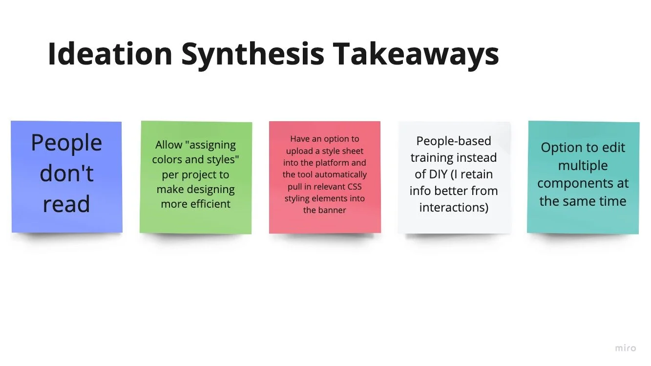
With the problem and scenario defined we could ask for ideas for a possible solution.
Our ideation session had 9 participants all of whom took the time to share their thoughts and ideas with us.
We received over 90 data points to start sorting out
Competitive Analysis
For the competitive analysis we chose the companies OneTrust, Consentmanager, Hyperproof, and Riskwatch. We chose OneTrust because during our client interviews they stated that OneTrust was their largest competitor.
As for Hyperproof, Consentmanager, and Riskwatch we found them through our research when we discovered a website called Sourceforge, a centralized online location to control and manage free and open-source software projects.
We chose to use General Data Protection Regulation and California Consumer Privacy Act compliance due to both us and our User Persona having to work with and around the privacy laws and regulations within the US and European Union.
This is also part of why we chose to include privacy impact assessment and data protection impact assessment features. After some digging around the internet and finding vital features some of which Crownpeak has to offer, others that they didn’t but all of these things that users value we included them in our competitive analysis
We chose these companies in the competitive analysis first because our clients stated that Onetrust was their primary competitor through our research we discovered other Digital Experience/Content Management platforms however, we were unable to get access to their customizable privacy pages so that led us to focus on our comparative analysis
Comparative Analysis
During our Subject Matter Expert interviews, they discussed the desire for WYSIWYG
We chose that drag and drop functionality and full customization aligns with our User Persona’s need to be able to handle multiple tasks at once
We included button duplication as many of our users and Subject Matter Experts vented their frustrations with various hotkeys in the programs listed in the competitive
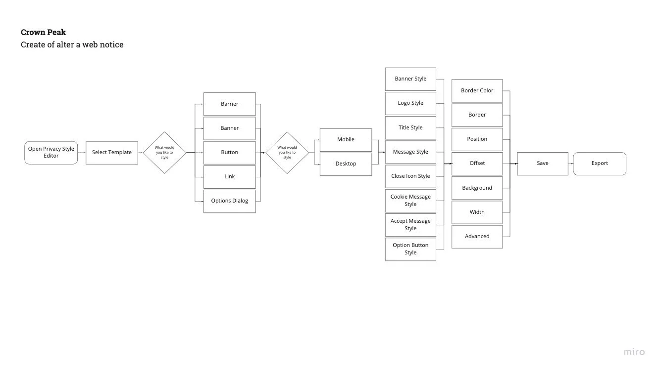
What is important for Mark is how many steps it takes to make a simple edit across multiple sites.
Although it doesn’t appear overly complicated, the majority of this process must be repeated over and over again to fulfill the goal of editing a complete privacy notice.
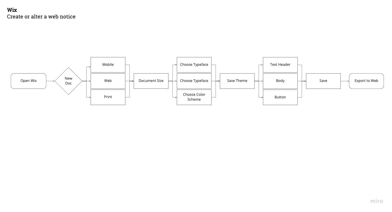
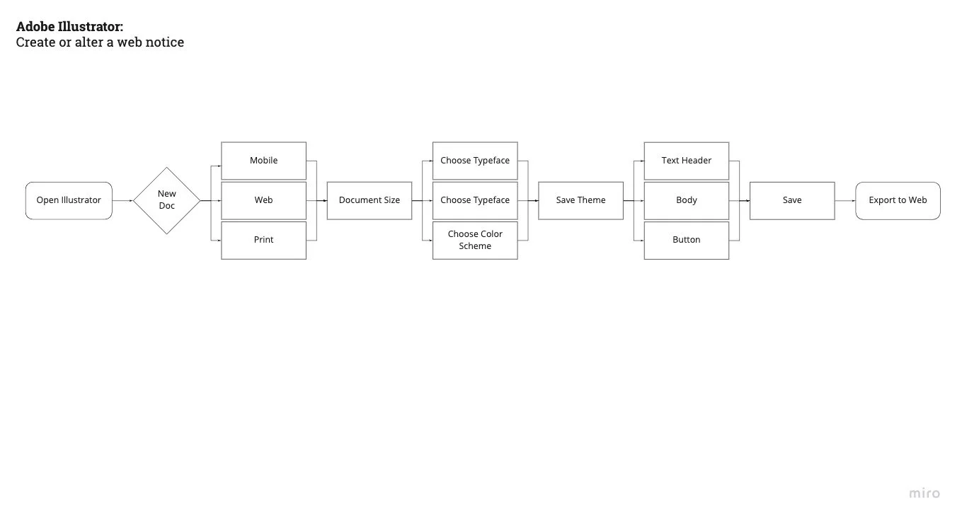
Two other styling platforms include Wix website builder and Adobe Illustrator, so we created task flows for a similar goal in these.
We would have loved to gain entry into the competitor’s notification building platforms, but not having business authentication presents its own challenges.
Some other platforms we compared were Figma, Sketch, Clip Studio Paint, and Canvas
Proposed Features
Ability to preview all styled notifications at one time
Ability to edit specific or global elements
Real-time suggestions and directed prompts during the creation
More adaptive template (using the upload feature)
Sketch Testing
Results:
People were VERY CONFUSED, about the navigation
40% of Users couldn’t finish the task.
Maybe they just needed higher fidelity?
Maybe they need a walkthrough
Lofi Prototype
People were still very lost within the navigation overall
Terminology was inconsistent and misleading to users
No one wanted to use the tutorial.
Difficulty determining when they were editing a specific element versus a “global” element

High Fidelity Prototype
Takeaways
Good communication is key
Keep a jargon glossary for esoteric concepts
Constant feedback between stakeholders and designers is crucial


