A challenge for good
The problem: After weeks of thorough research, collaboration with data scientists, developers, and UX designers and prototyping we developed a complete website to help new immigrants to the United States find a place to live.
The solution: Our team, in collaboration with the US Census Bureau, needed to create an innovative app to help recent immigrants to the United States find a good place for them to live.
UX Research Sprint Project
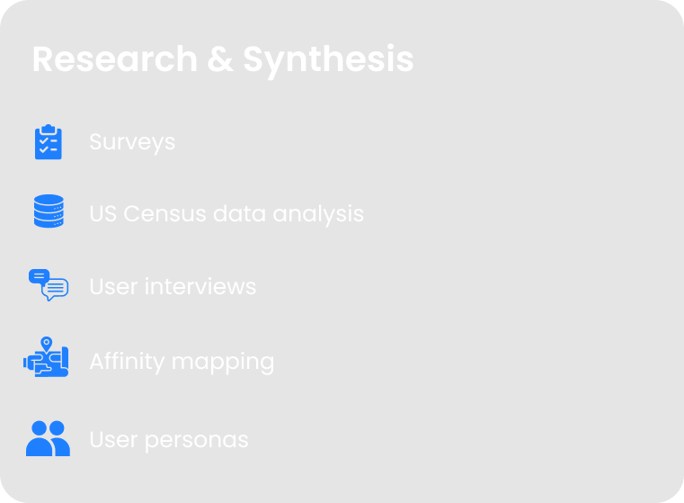
Process
Tools
User Survey
In order to figure out a solution we created a survey in both English and Spanish asking people questions such as why people moved to the United States, concerns that people have before, during, and after moving, both big and little differences between their home countries and The United States
Where in the US you would like to move to?
What challenges do you anticipate experiencing when dealing with the government of the United States?
What were the circumstances that motivated you to leave your home country?
Some of the primary survey takeaways:
Users had an impression of the United States was not what they had expected due to the difference between ‘movie America’ and ‘real America’.
Things such as healthcare and immigration bureaucracy were major concerns for our users
City Finder MVP
After synthesizing our data from user interviews and the survey and learning what our potential users biggest concerns about moving to the United States were we developed our MVPs
After our surveys, user and subject matter expert interviews we synthesized our data and created our User Persona. Meet Carolina Vasquez
Carolina’s Problem
Carolina wants to find a place in the United States where she feels comfortable.
She due to horror stories of the United States healthcare system she wants to make sure that she will be ok in an emergency
She wants to make sure she moves to the United States legally and doesn’t accidentally get into a lot of trouble by accident.
To show what Carolina is going through along with many, many immigrants to the United States we created a journey map.
Competitive Analysis
For our Competitive Analysis, we chose to base this off of other immigrant resource webpages such as Boundless Immigration, Simple Citizen, USA Hello, and Github. We chose to highlight factors such as is it responsive, is there an English Chatbot in the landing, and is their secondary navigation.
Lo-fi Prototyping
After we had created our user flows we created our sketch prototypes, a rough idea of what we and our users would like to see on our website.
Mid-fi Prototype
For our mid-fidelity prototype we developed an outline of what we would like to see in our final product. This includes about us, a profile page, a page for resources and a home page where our user can decide where they should move depending on climate, price, and population. We also included a results page in our mid-fi prototype.
High Fidelity Prototype and Finished Product
After updating our mid-fi prototype we updated it to our high fidelity prototype. We passed on all our hard work on to our team of developers and they made a real, functional Connect.US website.
Get a large pool of potential users from many different backgrounds
It is great to work with people who aren’t designers to get outside perspectives
You are designing for your users not yourself, don’t ever get too attached to any ideas.


